
Mothwire Journal
Claim the Range: A New Look for the Frontier
A coordinated theme rework brings the game's interface and location artwork into the same frontier world.
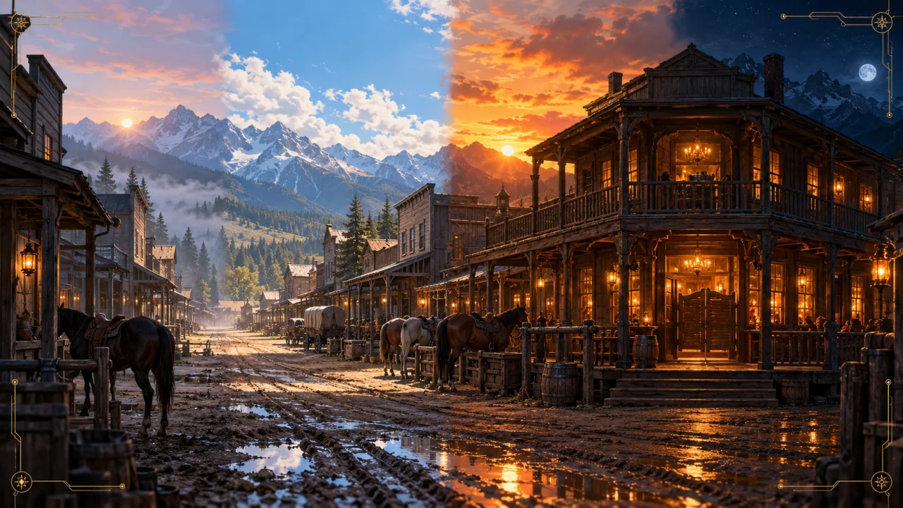
Claim the Range has always depended on its sense of place. The recent theme rework brought more of that frontier into the interface, while keeping the game itself familiar to play.
The game's older warm-brown panels gave way to a darker slate and charcoal foundation, with restrained brass accents and lighter text. The aim was consistency from screen to screen: the game view, account controls, Help, Rare Finds, and the Hotkeys card should feel like they belong to the same world. The landing and About pages were adjusted to carry that palette outside the signed-in game as well.
The larger visual change happened in the locations. Surface scenes and Forts gained artwork for morning, day, evening, and night. Players can let the image follow their saved local time or choose a fixed look in account settings. A Fort changes with the light without losing the buildings that identify its rank; a named town or service location keeps the landmarks and signs that make it recognizable.
That consistency took careful review. The Rusted Spur needed to remain The Rusted Spur through every lighting pass, and the Trading Post needed to keep its own name. Unfinished sets stayed on their established artwork until all four views were ready. The work was about seeing the same place under a different sky, rather than replacing it with a different place each time the hour changed.
Together, the new palette and time-of-day scenes make the frontier feel more connected. A player can move between the public pages, the game controls, and the places on the range without the visual language suddenly changing around them.